Know Your Fish
Client
Sector
Challenge
My Role
Project Time
Know Your Fish (KYF) is an initiative that works towards an ocean-friendly lifestyle. They encourage and empower consumers to eat seafood responsibly by providing informed choices that are based on a compilation of decades of marine research by biologists and researchers.
Environment Sustainability Initiative
To create, research, organise and design a compact, distributable Calendar for 12 months and a website. It was my responsibility to create a user experience and interface design to make this information available to everyone in the most accessible form.
Research, Information Architecture, Low and High-Fidelity Prototypes, Responsive Website Design, Web Development in HTML, CSS, JavaScript, CMS.
3 weeks for each project over a span of one year
Scope
I was required to complete three tasks which took place over a period of one year as per client demand.
- Create a one stop shop distributable Calendar for 12 months, for 50+ fishes, covering the east and west coast, and categorising them according to their vulnerability score.
- One year later, my client wanted to launch a new calendar design. This time, the challenge was to make it much more creative, compact and add a lot of additional fish data.
- Create a website that represents the company and its data.
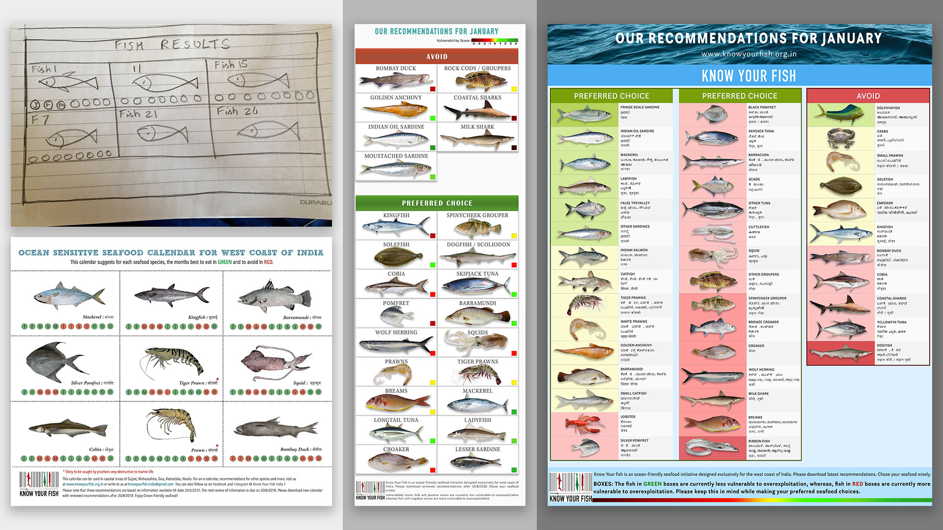
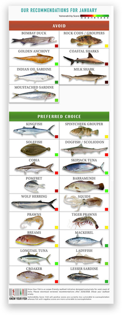
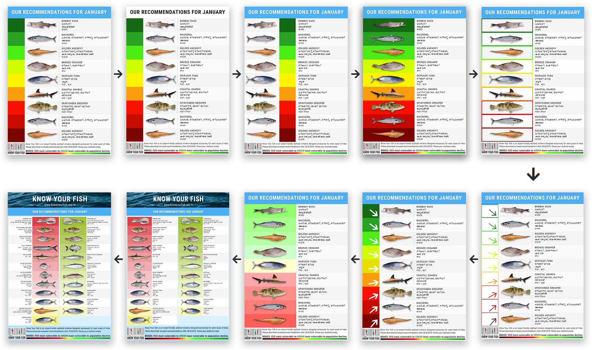
Part 1: Calendar for 12 months – First Design
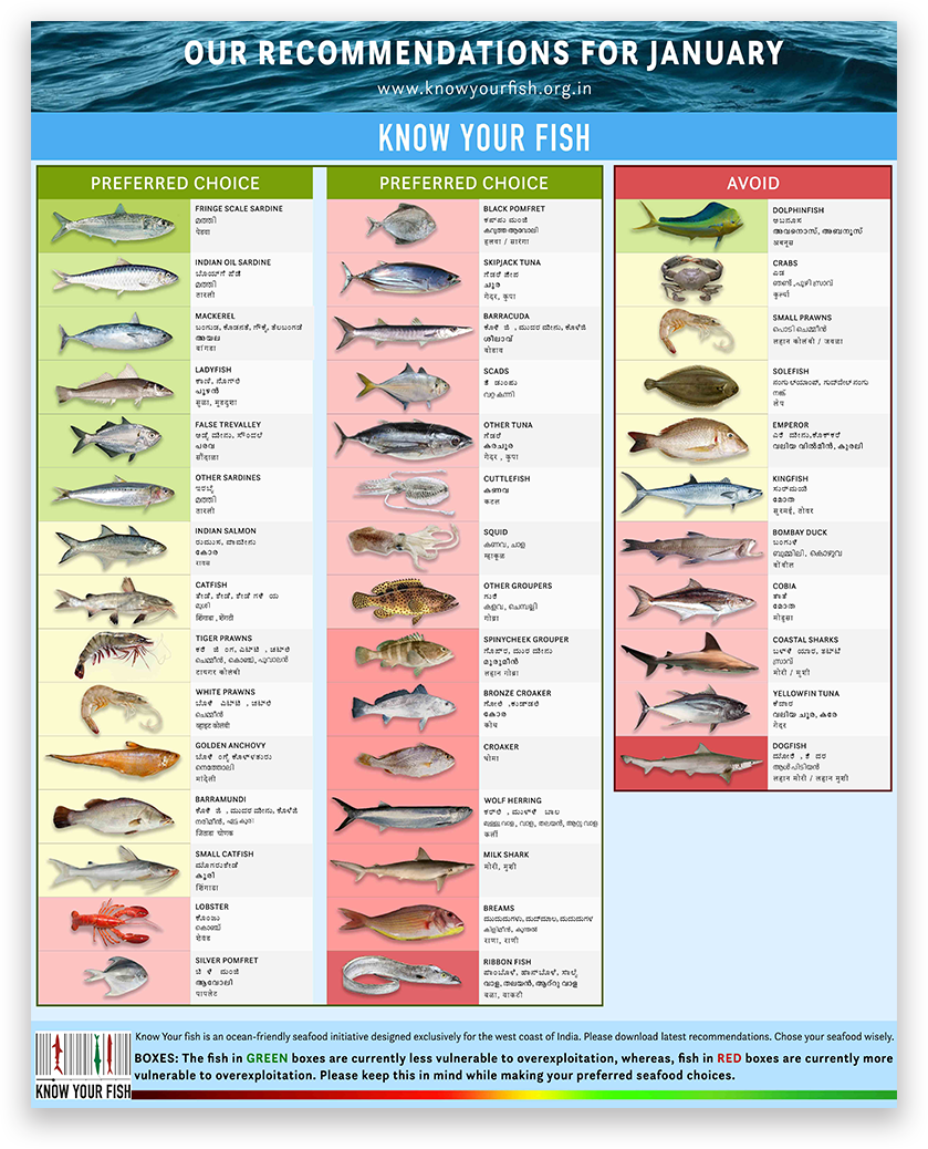
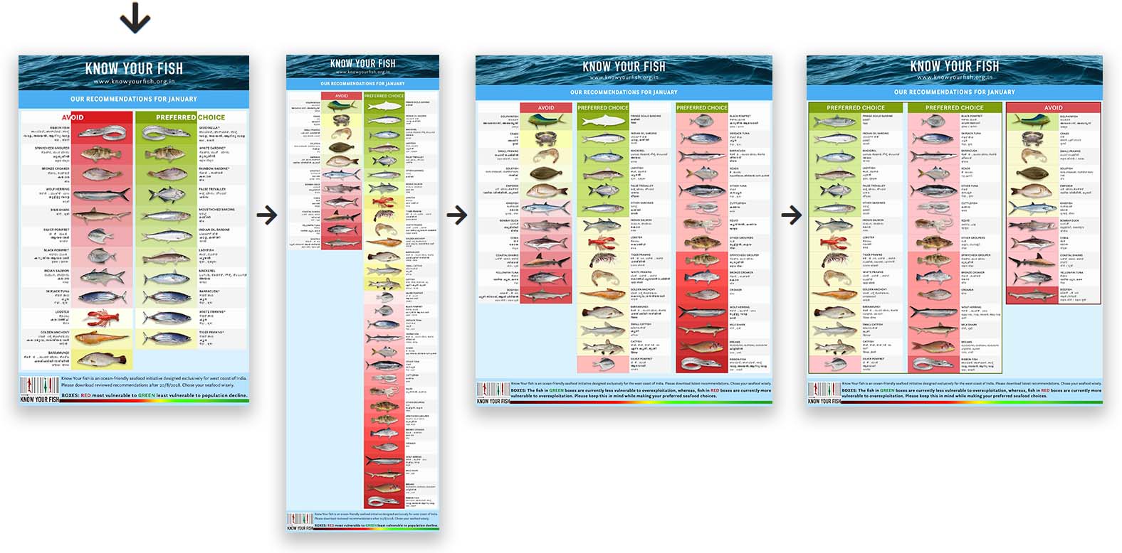
Part 2: Calendar for 12 months – Second Re-Design
DESIGNS FEATURED IN
Common Design Elements
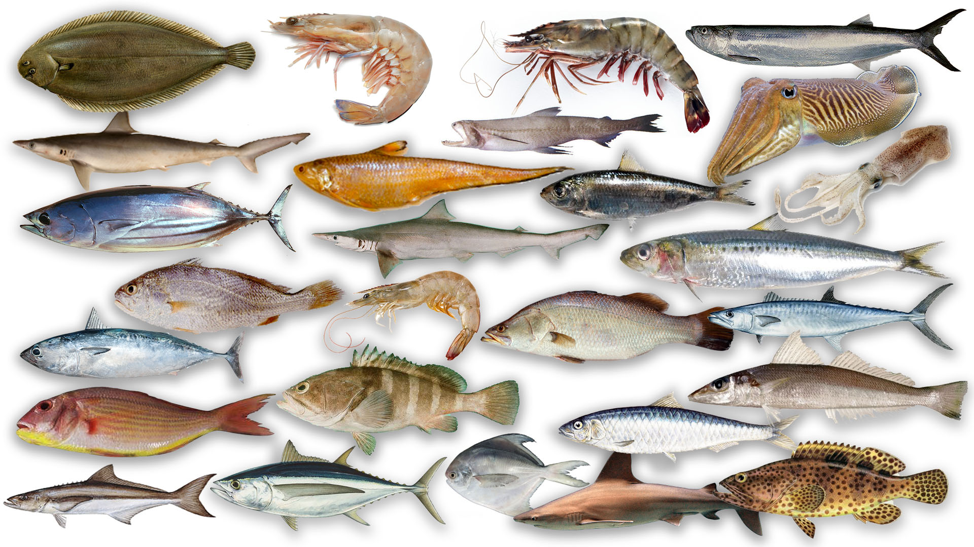
Fishes
- This design consisted of data compiled by decades of marine research by marine biologists and researchers. There was a total of 50+ fishes which were researched, and each fish was edited for the calendars.
- The idea was to convey information that did not enforce consumers to give up eating fish altogether but allowed them to choose which fish to eat and when.
- As people who value conservation as a morality and use tools like science, it was my responsibility to make this information available to everyone in the most accessible form.


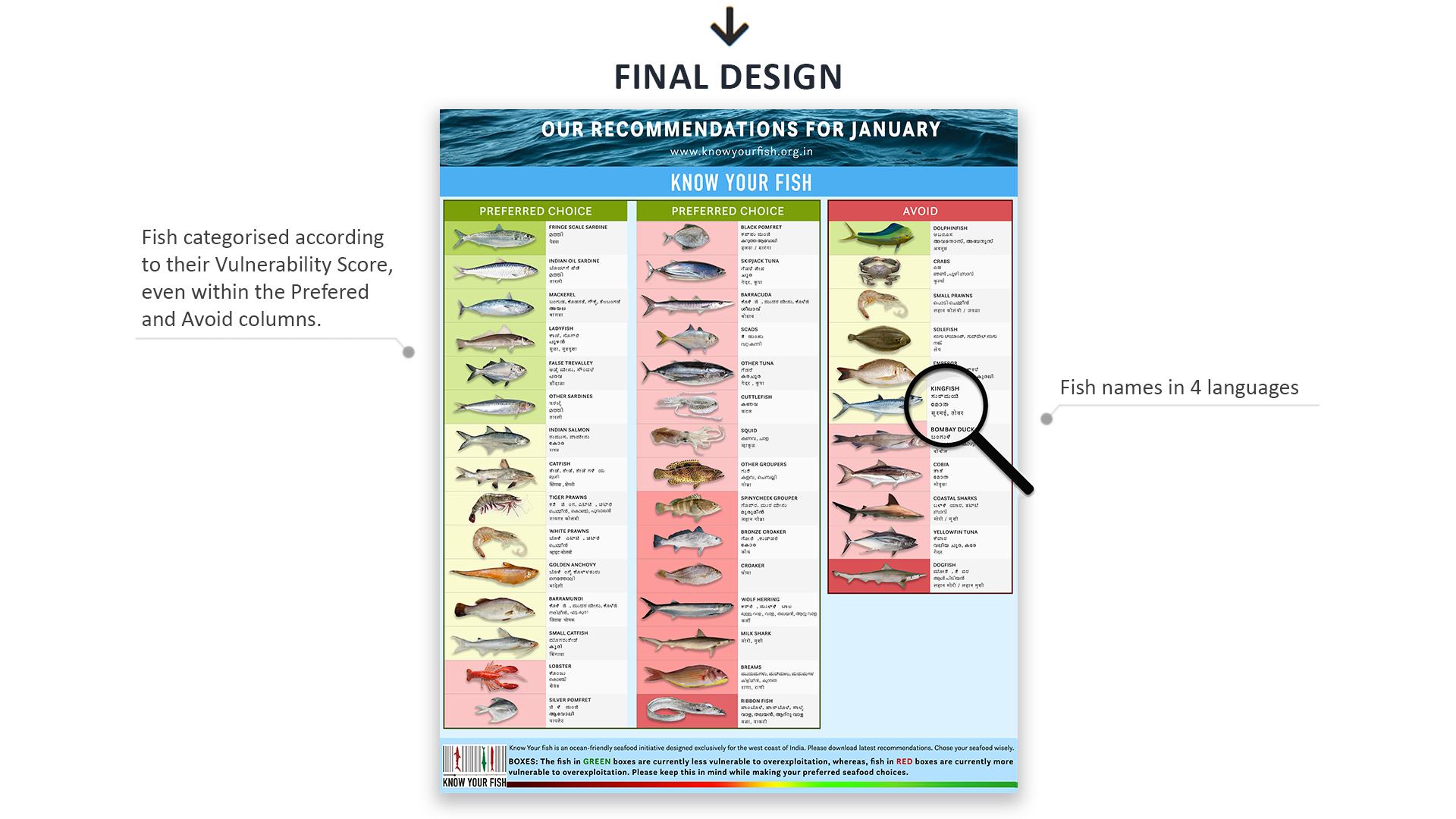
Vulnerability Score


- Each fish was assigned a vulnerability score according to which it was positioned in the calendar.
- The vulnerability score is a numeric value ranging from -5 to +5 with corresponding shades of color associated to indicate the fish’s vulnerability in each month.
- For instance, the Pomfret is most vulnerable in September to November and the months of April and May. For these months, the fish will be given a low vulnerability score in the range of -5 to -1, placing them in the ‘to be avoided’ category. When the fish has the lowest vulnerability score of -5, it is assigned a dark shade of red, meaning it can be extremely detrimental if one were to consume the fish during that period.
- This color association and month-wise vulnerability score provided an easy way to position the fish onto the sections whether they can be eaten or not eaten.
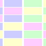
- The website is designed to place the to-be-eaten fish on the left side marked in shades of green boxes and not to be eaten fish on the right side marked in shades of red boxes. This kind of visual cue and vulnerability score-based positioning of content lets the user have immediate grasp of information.
Part 1: Calendar for 12 months – First Design
- The first design has a simple tabular design with each fish and its associated vulnerability score as data.
- Two tables are presented, one listing out the fishes to avoid and the next listing the preferred choice for the given month.
- The vulnerability score of the fish is indicated as a small colored square box on the right bottom of the cell with the color indicating the actual vulnerability score.
- The data is organized in a similar way for each month of the year.
- The visual design of this first design helps for easier classification of data and presents information in a single glance. It uses green to indicate high vulnerabilities scores, yellow for neutral, and red for the low score values. Additionally, the page also has a legend to show the score that each shade of color corresponds to. Thus, a good use of color theory has been made to present information.
- The box design, along with the rising up font face, also helps give a 3d effect that is quite pleasing to the eyes.
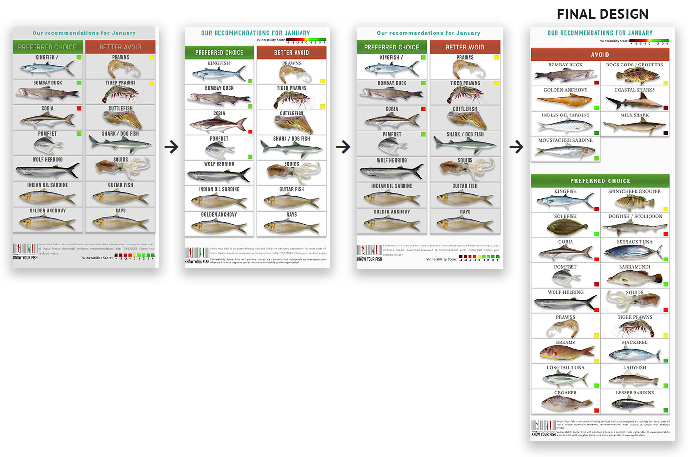
Part 2: Calendar for 12 months – Second Re-Design
- As the client wanted to include additional information such as the name of the fishes in local languages, the first design had to be refined upon.
- The fish name entry had additional information that was the local name of the fish in languages like English, Hindi, Malayalam, and Kannada to make sure even small-scale fishermen would be able to grasp the information readily. To make space for this additional info, the table was redesigned.
- The tiny square boxes were replaced by a pastel color schemed background color for the fish picture. This helps bring the reader’s view to the part we want to focus on, the vulnerability score for each fish.
- The table design was further refined to include the preferred choices on the left side and the Avoid items on the right.
Revisions and Iterations based on client requirements.
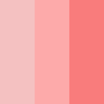
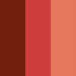
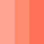
Visual Designs: Design Inspiration and Color Styles

The Impact
The site, with its neat and easy to grasp informational content, has become a one-stop-shop for people who want access to any information regarding the fish breeding cycles and seafood data.
People were able to easily understand the data and were able to make more responsible choices with their seafood consumption. People can now immediately get the information they need about seafood in their area without having to do extensive research themselves.
The site has boosted the credibility of the Know Your Fish initiative and has brought a better level of awareness of their efforts among their audience.